storyboard:
final video:
lindsaylamarca.web.illinois.edu/wp/2018/12/11/project-3-part-5-final-video/

Interaction1-BLOG-Madeline Farace
Fall 2018
storyboard:
final video:
lindsaylamarca.web.illinois.edu/wp/2018/12/11/project-3-part-5-final-video/
https://xd.adobe.com/view/17065566-d43c-4bf4-73c3-9cc46a5d23b2-6137/
https://xd.adobe.com/view/17065566-d43c-4bf4-73c3-9cc46a5d23b2-6137/
Manovich starts out the article by saying “With computers we can visualize much larger data sets; to create visualizations which are dynamic; to feed in real-time data”. Visually representing data connects to art and an artists statement more than one would think. Being able to conceptually and visually design a concept is hard and when executed well, something becomes artistic. Manovich states how visualization impacts medicine and the science side of things saying, “Modern medicine relies on visualization of body and its functioning; modern biology similarly is dependent on visualization of DNA and proteins”. This made me refer back to what the difference and similarities of visualization and mapping is. Manovich clarifies that “the term visualization is the situations when quantified data which by itself is not visual; and mapping is thought of representing all data using the same numerical code. Visualization then can be thought of as a particular subset of mapping in which a data set is mapped into an image. He then states that all representational art would fit under the umbrella of mapping. I found this interesting and sought to find out what hid definition of representational art is. Thinking of creating a concept and boiling everything down into one narrative or single image is something that fits into a mapping category. However what if an art piece has multiple narratives? does this now not fit into the mapping category? This then made me think of other forms of art that don’t include 2d media. Can acting or dance be thought of as mapping or even visualization? It has the potential to explore one narrative (or many) and can provide an artistic structure. However the conversation was brought to new media and what it explores with mapping and visualization. Re- mapping was brought up and described as new however the idea that museums existing for a long time ringed a bell in my mind. I feel that museums have been storing mapping and re mapping knowledge regarding art pieces for as long as they have existed. Time being mapped into space was an interesting point that Manocich was talking about when referencing cinema art. I never thought about it in this way and it was an interesting way of thinking that got me asking questions. If this is mapping time within space, how would audio be looked at? Because my first thought would be that it is looked at in the same way: mapping time in space. however, there could be an argument saying that audio isn’t really mapping time bur rather something else; and if so what would be the something else? He describes this as meta media saying that it pulls together language and meta language which ultimately proves that audio would be apart of this grouping. The idea that digital art being described as meta media is cool to me as well. Because it isn’t much different than the “old art” that he is referencing, but it is the mapping component that keeps its difference. I suppose that the mapping in digital art is the use of a computer finding where a user wants to make a mark and having a grid type of thinking in the actual design of the interface in order for the action to be accurate within the software. Data visualization artists mapping concepts and ideas and things into existence is something that hit home for me. It put this in prospective of why this is being done and answers the “how”; Manovich calls this the anti-sublime. If an artist cares enough about a topic to want to bring awareness to it in the art world or just to the world in general through their art, the idea of “mapping it in” is very cool. I never thought of conversions and concepts to be mapable but this proves me wrong and gives me a whole new lens to look through. The question of diluting the value was brought up when talking about the ease of mapping computers and the internet provides. I think this is a valid point that holds truth but without freedom in the arts to let anyone put their stuff out there, it becomes a conversation of what is art and who defines it. Which in turn is a bigger battle than the latter. He closes this conversation off with this comment, “For me, the real challenge of data art is not about how to map some abstract and impersonal data into something meaningful and beautiful – economists, graphic designers, and scientists are already doing this quite well. The more interesting and at the end maybe more important challenge is how to represent the personal subjective experience of a person living in a data society.” I think it concludes all of the topics brought up very well and in turn provides the reader with a fire in their heart to express their artistic subjective while living in this data oriented society; at least it did for me.
Carto city – Madeline Farace –
He starts the article out by explaining how maps are made and how the plans must me imaging and drawn out before anything else happens, saying “In cities with complex underground rail systems it can take years before the point pattern is fully coordinated with the surface experience”. Everything here makes sense, because with anything there must be a plan. Cosgrove states “in every way the map registers the city as a distance place and a unique landscape” giving us a general unbiased definition of what maps are and what they do. He states his thesis soon after saying “I have chosen here to explore how the modern city as material and social space interacts with the map as scientific instrument and artistic representation of its space and life”. A point that I found interesting is the fact that these zones on maps determine our everyday life and have us under control in a way. He states that things such as zip codes and zoning ordinances for schools and towns trap us in a system. This made me understand how one gets trapped in a routine of using the same paths: we were put in a position to get trapped within them from the start. If one breaks out of their normal designated path, it seems out of the ordinary and odd, I think this is what Cosgrove will expand on in his article. He touches on the grid saying that “the grid can easily be elaborated to generate open spaces to interrupt its monotony and produce public space within an otherwise privatized space”. He says that determining your location and translating it is what modern day direction services use in order to work the way that they do. However this calls into question privacy doesn’t it? The question of who receives your location when using services like GPS is eye opening and alarming. He then talks about urban maps legibility saying that traditionally “the city was to be read as a text for its rulers, citizens, and its visitors” and at its core not much has changed off this definition of initial intentions. The author goes on to point out that by having up to date images for every electronic map, rather than a birds eye viewing, it in turn emphasis unity and civic order. I was skeptical of this at first but when thinking about it, having a representational picture of your home town where the landmarks are emphasized it creates pride within the town and unites the citizens together. I never thought about how maps could unite us in that way before and this proves that maps have more power than just getting someone from point A to point B. Phylis Pearsall’s walk to find an individual address without an adequate street guide of London resulted in a handbook for every londoner but it in turn reduced every urban element to the same format loosing the ideals of having a coherent structure that favors legibility in a very coded area. This attempt took out the individuality of each map and emphasized the faith in geometry. Artistically speaking, a map could be very “STEM” oriented however it also has the possibility to express individuality and have meaning. I feel that this contrast talks on this and explains the differences in how one looks at a map. One could look at it as a tool and guide to mathematically find the best path and another could look at it as a chance to break out of the lines and express themselves individually in this type of way. Artists also have a platform through maps to show graphically their message. This spoke to me because I never thought of having a map making a statement worth sharing in an artistic world. I learned that one can create meaning out of emotional maps and ones that prove how citizens are coping. Overall, this article showed me how maps evolved, tested the limits, and can be used in a very artistic way.
Multidisciplinary interaction design for alternative city tourism – Madeline Farace –
This project right off the bat states that they “played in and with the city in order to design something playful for the people in it” ultimately offering creative ways to approach other design projects. They talked about their inspirations saying that it was the “invisible cities” saying that it is the phenomenon when you first get to a new place and explore and are excited about everything then once you stay in this place for a while one starts to fall into a rut of patterns and are no longer excited about seeing new things. This speaks to the example we did in class and how everyone drew their maps of their lives in champaign and how the overwhelming majority of feelings were bleek and disinterested. We fell into a rut and are no longer challenging the paths and lines that we fell into. Within this experiment some people used game like strategies to try and break out of the rut and see new things. This also related heavily to what we did in class and how everyone had an interesting thing one will walk towards and also a negative aspect where one is turned away. This was an exercise to try and break us out of our paths. However as one can see, the moment something gets difficult the natural reaction is to find a shortcut. So as much as we love games, being competitive in a setting where it was not implied to be competitive took over most of the class. Therefore proving the game like strategy to only hold up within certain circumstances. Something that I thought was interesting within this article was the second intervention of “rent-a-tourist” where they had locals and tourists interact and allow the tourist to experience things like a local. This brings up an interesting idea when thinking of the rut that most everyone falls into. When gluing someone who is excited about new paths to someone that knows them like the back of their hand and has lost interest what will happen? The idea ended up failing in the city that they were in but it was an interesting concept that got me thinking. I feel that this approach would have many hiccups in the fact that both participants would be acting in a very front stage manner and not truly experience the experiment the way it was intended. I feel that the tourist would try to downplay their excitement and try to act more like a “local” and compress their feelings that make them a tourist. I also feel that the local would end up putting on a show, and in turn heighten how they feel about the streets that they are bored of and walk everyday. This would have been an interesting clash however not on target with what they are trying to explore within the experiment. The two prototypes ultimately made were the T-shirt design and the mystery cube. I feel that it was a very creative way to get people out of their normal paths and to explore but my only worry would be safety. It says in the direction to “ find a friendly looking person” and either ask them to roll the cube and show you where to go or show you where you are with the shirt. This is a stranger danger situation some people might not be interested in doing and risking especially if they are traveling alone. On the other hand I feel that although the locals would be pulled out of their normal paths, most wouldn’t want to participate. Because while tourists are on holiday and away from their jobs and most responsibilities, the locals aren’t and this could just add to the annoyance of their path most traveled. Overall they acknowledge that the designs are highly situational and remains in the paper prototype phase, they hope to have this experiment prove to be inspiration for more radically convivial, multidisciplinary and critical interaction designs. I think that they have successfully got any readers mind flowing with ideas of what interaction design they want to create within their own community.
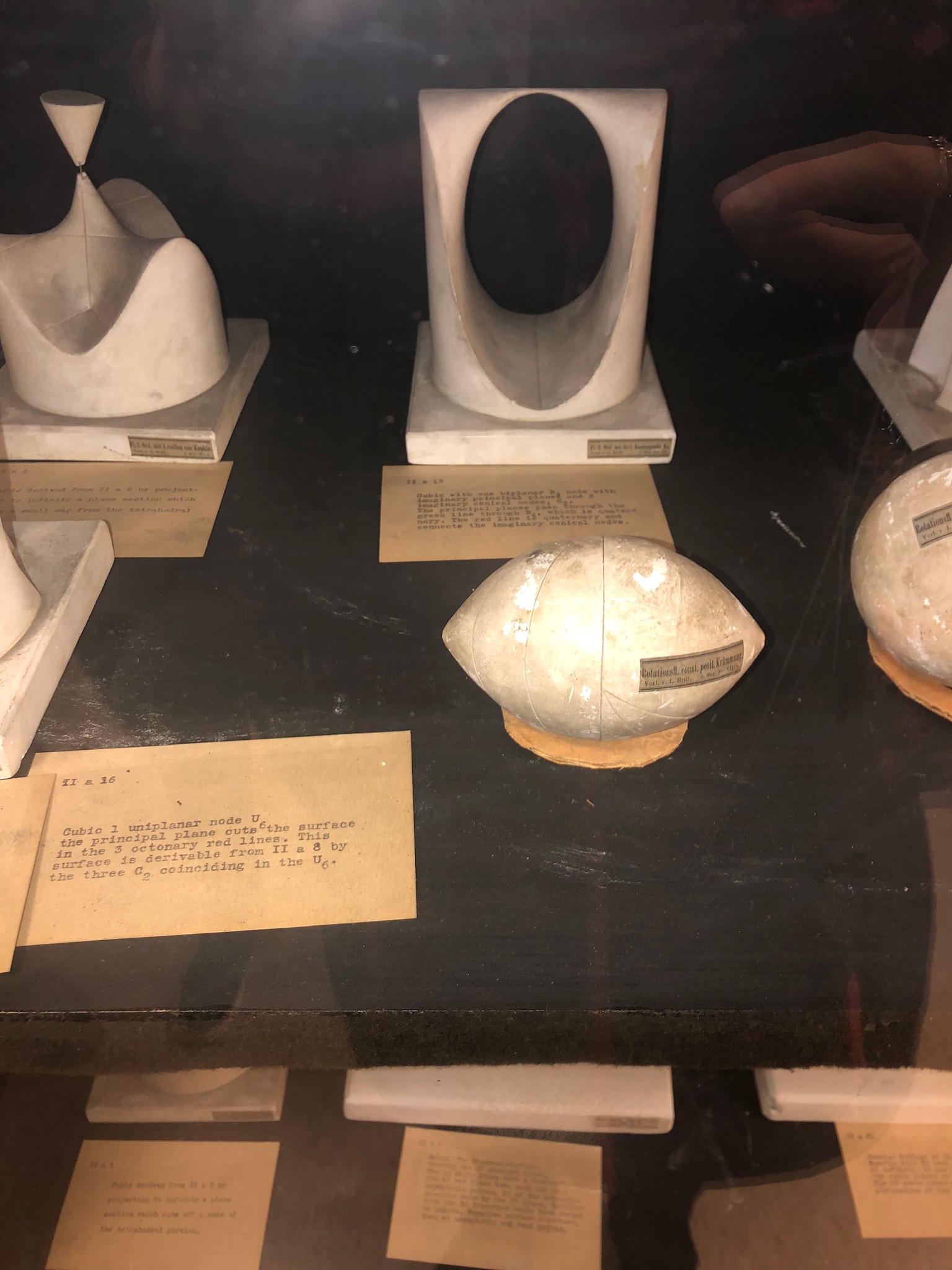
The last picture is of the mathematical model that I connected to the most and felt represented my personality. I noticed that it was more simple in the way that it didn’t have many intricate lines or patterns and was overwhelmingly smooth. I felt that even though it was small, it had a lot to say and I think that speaks to my personality. I am very extroverted and have things to say on everything but I feel that I present in a small way when one simply looks at me. I tend not to come across in a very front stage way in most circumstances and I think that plays a role in the size of the model that I chose. The smoothness and marbled look showed that it was different and I think that my personality is different from others in the sense that I’m not rough around the edges and will talk to anyone. After the fact I noticed that it was in the shape of a lemon and I thought of the “when life gives you lemons” quote, so now i’m calling myself a lemon of a personality.